
Unlocking the Power of Colour in Printing for Brand Archetypes
In today’s fast-paced and competitive market, colour is so much more than just a design element—it’s a language. It speaks to your audience on a subconscious level, evoking emotions, building connections, and shaping how people perceive your brand. Think about it: a fiery red can ignite excitement, while a soothing blue can instantly build trust. When you pair these colours with the concept of brand archetypes, the impact becomes even more profound.
For marketers, designers, and business owners, understanding this relationship is key to creating print materials that don’t just look good but also leave a lasting impression. Let’s dive into how you can harness the power of colour to align with your brand archetype and truly connect with your audience.
What Are Brand Archetypes?
Brand archetypes are like the personalities of your brand—universal characters that tap into human emotions, desires, and stories. Inspired by Carl Jung’s theories and widely used in marketing, these archetypes help brands create a deeper emotional bond with their audience.
There are 12 main brand archetypes, each with its own unique traits:
- The Hero: Bold, determined, and inspiring (think Nike).
- The Sage: Wise, thoughtful, and knowledge-driven (like Google).
- The Jester: Fun, playful, and full of humour (hello, M&M’s).
- The Lover: Passionate, intimate, and luxurious (Tiffany & Co. nails this).
- The Creator: Innovative, imaginative, and original (Apple is a perfect example).
- The Ruler: Powerful, sophisticated, and in control (Rolex embodies this).
Each archetype speaks to specific emotions and aspirations, shaping how people interact with your brand. For instance, Nike’s bold imagery and colours inspire action and achievement, while Tiffany & Co.’s soft blues and elegant designs evoke romance and luxury.
By pairing the right colours with your brand archetype, you can create print materials that not only catch the eye but also resonate on a deeper level.
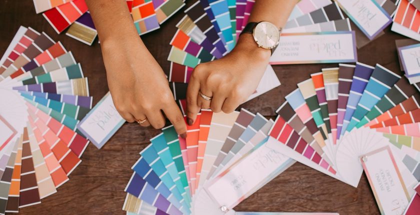
The Psychology of Colour in Print
Colours aren’t just pretty—they’re powerful. They trigger emotions and influence behaviour, making them a critical part of your branding strategy. Here’s a quick breakdown of what different colours can communicate:
- Red: Passion, energy, and excitement (Coca-Cola’s iconic red is a great example).
- Blue: Trust, calmness, and reliability (IBM’s blue is a classic).
- Green: Growth, nature, and harmony (think eco-friendly brands).
- Yellow: Joy, optimism, and creativity (McDonald’s golden arches are instantly recognisable).
- Orange: Enthusiasm, warmth, and friendliness (perfect for adventurous brands).
- Purple: Luxury, royalty, and mystery (Cadbury’s purple is a standout).
- Black: Power, elegance, and sophistication (premium brands love this).
- White: Purity, simplicity, and innocence (ideal for minimalist designs).
Understanding these associations helps you choose colours that align with your brand’s identity and archetype, ensuring your print materials make a memorable impact.
How Colour Aligns with Brand Archetypes
To create cohesive and impactful designs, it’s essential to match your colour choices with your brand archetype. Here’s how you can do it:
- The Hero: Bold reds, deep blues, and metallic tones inspire energy and determination.
- The Sage: Earthy greens, browns, and blues convey wisdom and stability.
- The Jester: Bright yellows, oranges, and playful pinks evoke joy and creativity.
- The Lover: Soft pinks, reds, and deep greens symbolise passion and intimacy.
- The Creator: Vibrant yellows, greens, and blues reflect innovation and originality.
- The Ruler: Deep blues, purples, and golds exude power and authority.
- The Magician: Deep purples, blacks, and metallics suggest transformation and mystery.
- The Outlaw: Black, red, and silver make a bold, rebellious statement.
- The Explorer: Blues, greens, and earthy tones represent freedom and adventure.
- The Caregiver: Soft greens, blues, and pastels convey nurturing and care.
- The Innocent: Whites, pastels, and light yellows reflect purity and optimism.
- The Rebel: Bold blacks, reds, and contrasting tones challenge the status quo.
Bringing Colour to Life in Print
Choosing the right colours is only half the battle—how they come to life in print is just as important. Whether you’re designing brochures, business cards, or banners, the quality of the printing process can make or break your campaign. Vibrant, accurate colour reproduction ensures your brand identity stays consistent and impactful.
For businesses in Melbourne and Sydney, working with professional printing services is a must. There’s a growing demand for high-quality printing jobs in Melbourne and printing jobs in Sydney that deliver exceptional results for marketing campaigns.
Why Colour Consistency Matters
Consistency is key when it comes to branding. Every piece of print material—from flyers to billboards—should reflect your brand archetype and colour palette. This not only reinforces brand recognition but also builds trust with your audience.
Conclusion
Colour is more than just a design choice—it’s a storytelling tool. When used strategically, it can strengthen your brand’s identity, evoke the right emotions, and drive engagement. By aligning your colour choices with your brand archetype, you can create print materials that truly resonate with your audience.
Ready to bring your brand vision to life? Explore professional printing jobs in Melbourne and printing jobs in Sydney with PrintJobs. Find experts who can help you craft vibrant, impactful print materials that make your brand stand out. Don’t wait—start making an impression today!